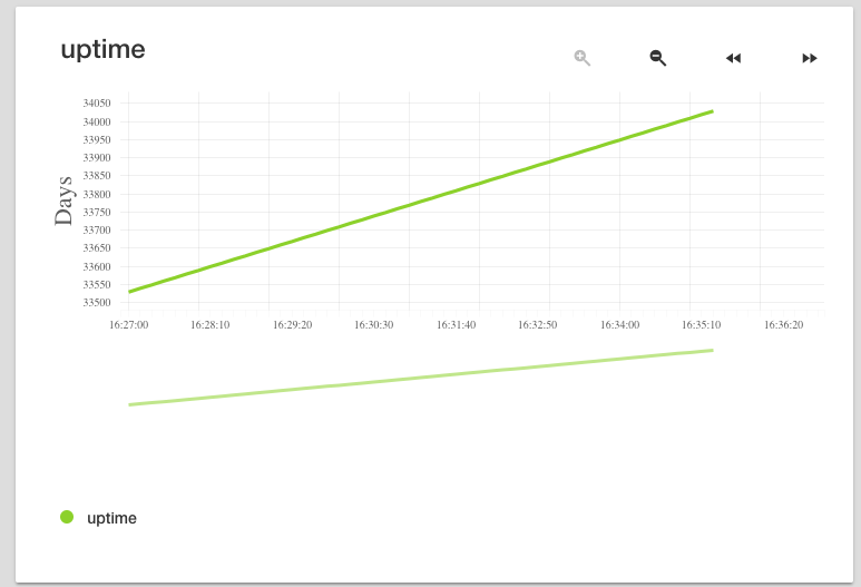
In FreeNAS-11.2-RC1, I visit the web gui, select Reporting (left hand menu) and System (across the top) and I look at the uptime graph.
The Y axis of the graph is labelled "Days" but the numbers currently displayed range from 33500 to 34000. I'm fairly sure that 11.2-RC1 hasn't been out 33000 days! ... and I did reboot today (to fix a physical issue with one of the boot environment USB sticks)... I think the graph is showing me numbers in seconds, not days. One potentially relevant change I recently made (today, shortly before discovering this issue) was to change the timezone, but I don't remember if I've ever checked this graph in this version of FreeNAS.
Is anyone else seeing this in 11.2-RC1 ?
Also, this graph (and all graphs in all reports) seems to have a duplicate plot of the data below the x-axis labels. Is this a feature? (what's it for?) or something unexpected?
Image attached showing both issues:

In case the second issue is a client-side rendering thing, I'm viewing this on Chrome Version 70.0.3538.77 on a Macbook Pro running High Sierra, but it does the same in Safari. I'll try a Windows machine later.
System details:
OS Version:
FreeNAS-11.2-RC1
(Build Date: Oct 17, 2018 23:38)
Processor:
Intel(R) Xeon(R) CPU E3-1225 v3 @ 3.20GHz (4 cores)
Memory:
20 GiB
Hardware:
Lenovo TS140
The Y axis of the graph is labelled "Days" but the numbers currently displayed range from 33500 to 34000. I'm fairly sure that 11.2-RC1 hasn't been out 33000 days! ... and I did reboot today (to fix a physical issue with one of the boot environment USB sticks)... I think the graph is showing me numbers in seconds, not days. One potentially relevant change I recently made (today, shortly before discovering this issue) was to change the timezone, but I don't remember if I've ever checked this graph in this version of FreeNAS.
Is anyone else seeing this in 11.2-RC1 ?
Also, this graph (and all graphs in all reports) seems to have a duplicate plot of the data below the x-axis labels. Is this a feature? (what's it for?) or something unexpected?
Image attached showing both issues:
In case the second issue is a client-side rendering thing, I'm viewing this on Chrome Version 70.0.3538.77 on a Macbook Pro running High Sierra, but it does the same in Safari. I'll try a Windows machine later.
System details:
OS Version:
FreeNAS-11.2-RC1
(Build Date: Oct 17, 2018 23:38)
Processor:
Intel(R) Xeon(R) CPU E3-1225 v3 @ 3.20GHz (4 cores)
Memory:
20 GiB
Hardware:
Lenovo TS140


