This one was built in 2018, but I reused the name from a previous build. This is the 8th FreeNAS unit I have built for home. Eight systems in ten years... I made some mistakes along the way, learned some and I try to share some of those lessons learned experiences here in the forum. I have even put together some hardware just to test things out a time or two...
For a while I had three systems, all at once, at home but I am making some hardware changes right now and only one NAS is online.
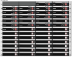
The three pools in this one system represent the three NAS systems I had before the consolidation. For a home NAS, this chassis is huge, able to hold 48 data drives and two boot drives with a couple spaces internally for non-hot-swap drives...
Case: Chenbro 4U 48 bay Chassis NR40700
- new old stock -
http://www.chenbro.com/en-global/products/RackmountChassis/4U_Chassis/NR40700
System board: SuperMicro Motherboard X9SRL-F, LGA 2011/Socket R, IPMI
- new old stock -
http://www.supermicro.com/products/motherboard/Xeon/C600/X9SRL-F.cfm
Processor: Intel Xeon E5-2650 V2, 2.6GHz 8 Core (16 thread)
-
https://www.cpubenchmark.net/cpu.php?cpu=Intel+Xeon+E5-2650+v2+@+2.60GHz&id=2042
Memory: 128 GB of 16GB sticks Samsung brand PC3-12800R, DDR3 Registered ECC
HBA: LSI/Broadcom SAS9207-8i, 6Gbps SAS PCI-E 3.0 HBA - flashed to IT Firmware: 20.00.07.00
-
https://www.broadcom.com/products/storage/host-bus-adapters/sas-9207-8i
Connected to: two 6Gb/s 24-port 3.5" mini-SAS expander backplanes (80H10024001A0)
Emily pool: 2 vdevs
vdev-0 = 6 x 4 TB drives in RAID-z2 (6 Seagate Desktop drives - ST4000DM000-1F2168)
vdev-1 = 6 x 4 TB drives in RAID-z2 (6 Seagate Desktop drives - ST4000DM000-1F2168)
Irene pool: 2 vdevs
vdev-0 = 6 x 4 TB drives in RAID-z2 (6 Seagate Exos drives - ST4000NM0115)
vdev-1 = 6 x 4 TB drives in RAID-z2 (6 Seagate Exos drives - ST4000NM0115)
Backup pool: 2 vdevs
vdev-0 = 4 x 6 TB drives in RAID-z1 (4 WD Gold drives - WD6002FRYZ)
vdev-1 = 4 x 6 TB drives in RAID-z1 (4 WD Gold drives - WD6002FRYZ)
Boot pool: 1 vdev with 2 x 40 GB notebook drives in mirror (2 drives total - FUJITSU MHW2040BS)
Jails: running 1 iocage jail (Plex) using danb35's script:
https://www.truenas.com/community/resources/scripted-plex-installation.129/
Additional NIC: MELLANOX 10GB CONNECTX2 - MNPA19-XTR